
Road games in the Big 12 hit differently. That’s just a fact. Whether it’s the roar of 60,000 fans in a blackout crowd or the relentless pressure of proving your worth away from home, road wins always seem to carry a little extra weight. But let’s be honest, looking good while doing it matters too.
Since the Big 12 expanded to 16 teams in 2024, the uniform scene has gotten…well, a little wilder. We’re talking about 16 different programs, each with their own flavour, history, and take on what a college football road look should be. Some play it safe. Others bring out bold colours, weird fonts, or helmets that make you ask, “What am I even looking at?”
So, we decided to do what everyone loves to argue about: rank them.
Now, just a quick disclaimer, this list is based on each team’s most commonly worn road look from the 2024 season. Yes, we know some teams mix it up weekly. But we’re focusing on what fans saw the most on Saturdays.
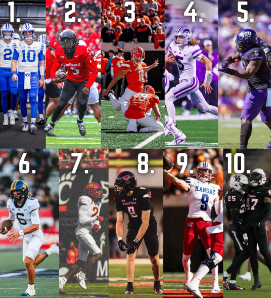
- Cincinnati
We’ll just come right out and say it: these all-whites could’ve been sleek. Instead, they’re loud in all the wrong ways. The oversized “C” logo is everywhere helmet, chest, shoulders and after a while, it starts to feel more like a branding seminar than a football uniform. The look tries to do too much and ends up losing its identity in the process. Simplicity isn’t bad, but this isn’t it.
- UCF
Now, on the flip side, here’s a jersey that went so simple, it forgot to have fun. No gold accents, no outlines, no creativity. It’s just there. Clean? Sure. But forgettable. UCF has great colours to play with, black, gold, even hints of pewter but instead they opted for the “basic white tee” of college football uniforms. Safe, but kind of sleepy.
- West Virginia
You almost feel bad ranking WVU this low because parts of the uniform work. The blue pants? Sharp. The gold-trimmed numbers? Eye-catching. But the ‘WV’ branding is a bit much slapped everywhere like someone got a new logo sticker pack and couldn’t help themselves. Still, it’s not a bad look. Just needs a little restraint.
- Baylor
The Bears brought back the green pants with the white jerseys, and honestly, it works decently. But the helmet feels like it belongs to a completely different outfit. The matte gold doesn’t quite blend with the crisp white-and-green base, and the font choice for the numbers still looks stuck in the Art Biles era, not terrible, not great.
- Kansas State
Classic, no-nonsense football threads. White tops, purple pants, silver helmets, it’s K-State. There’s not much to nit-pick, but also not much to get excited about either. It’s the football version of meat and potatoes, solid, dependable. Won’t blow your mind.
- Iowa State
The Cyclones’ red pants give the white jerseys a nice pop. The script font on the helmet is still a little love-it-or-hate-it, but overall, the look is balanced and sharp. Not flashy, but cohesive.
- BYU
BYU’s white road jerseys with royal blue numbers and navy pants are clean. The stretch “Y” on the helmet is iconic. They keep it simple but stylish, something UCF could learn from, honestly. The lack of unnecessary noise gives it that classic college football vibe.
- TCU
Purple numbers on white, black helmet up top, and purple pants below. It’s a solid combo with a little edge. The horned frog details around the collar are subtle but cool. It’s not the flashiest uniform, but it’s got some swagger to it.
- Kansas
Kansas’s uniforms have come a long way. The Jayhawks pair white jerseys with blue pants and red trim, which gives them a nice splash of colour without being overwhelming. It’s bold in a good way, and it helps that the program has finally backed it up with some wins.
- Oklahoma State
OSU’s black helmets with the Pistol Pete logo paired with white jerseys and orange pants? Nice. The look leans heavily into the Cowboys’ brand, and it works. It feels unique, not just a copy of every other white-on-white combo out there.
- Texas Tech
The Red Raiders’ white tops with black numbers and red pants bring balance and intensity. The double-T logo is sharp as ever. It’s a classic modern look if that makes any sense, and it hits all the right notes without trying too hard.
- Colorado
Black helmets, white jerseys, gold numbers, and pants. The Buffs are dripping in swagger. This uniform is bold but not loud, modern but rooted in tradition. Deion Sanders’ squad makes it look even better, too.
- Arizona State
Bright yellow pants and numbers outlined in maroon? Yes, please. The Sun Devils might not win every game, but they win a lot of style points. Their uniforms are fun without being clownish. They feel like Arizona State is vibrant, confident, and may be a little flashy.
- Houston
Houston surprised a lot of folks this year, and not just on the field. The Cougars’ road kit, with white jerseys, red pants, and red helmets, is one of the cleanest in the Big 12. Simple palette, strong identity, and consistent execution.
- Utah
Utah’s white and red combo is crisp and aggressive. The hand-drawn feather decal on the helmet is a beautiful touch, and the overall look is streamlined. There’s tradition here, but it’s not afraid to feel modern.
- Texas
White jerseys, white pants, burnt orange helmets. No frills. No weird font. No gimmicks. Just a clean, confident, instantly recognizable look. It’s Texas, and like it or not, they make basic look elite.
In a conference as deep and unpredictable as the Big 12, even the uniforms bring the drama. Whether you’re into modern flair or traditional swagger, there’s a little something for everyone. One thing’s for sure: when you win on the road and look good doing it? That is a statement.
Fatal error: Uncaught Error: Call to undefined function have_rows() in /home/bigsport/public_html/wp-content/themes/foxiz/templates/single/templates.php:606 Stack trace: #0 /home/bigsport/public_html/wp-content/themes/foxiz/templates/single/templates.php(569): foxiz_single_entry_content() #1 /home/bigsport/public_html/wp-content/themes/foxiz/templates/single/standard-1.php(43): foxiz_single_content() #2 /home/bigsport/public_html/wp-content/themes/foxiz/templates/single/layouts.php(59): foxiz_render_single_standard_1() #3 /home/bigsport/public_html/wp-content/themes/foxiz/templates/single/layouts.php(42): foxiz_render_single_post() #4 /home/bigsport/public_html/wp-content/themes/foxiz/single.php(8): foxiz_single_post() #5 /home/bigsport/public_html/wp-includes/template-loader.php(125): include('/home/bigsport/...') #6 /home/bigsport/public_html/wp-blog-header.php(19): require_once('/home/bigsport/...') #7 /home/bigsport/public_html/index.php(17): require('/home/bigsport/...') #8 {main} thrown in /home/bigsport/public_html/wp-content/themes/foxiz/templates/single/templates.php on line 606